Flows: Popup
With the Popups module, you can design Popups and forms for your website from scratch, and easily collect information from your website's visitors.
Navigation page
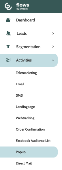
Popups can be found under the Activities menu.
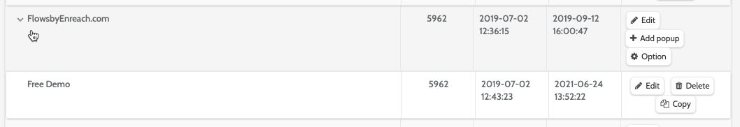
In the navigation page you can see all the existing Popup Groups and Popups.
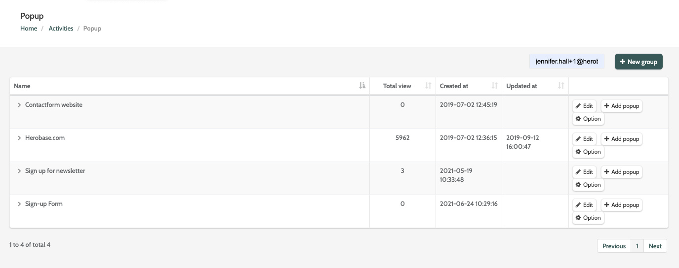
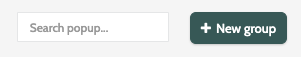
Use search to find a specific popup, or click + New group to create a new popup group.
What is a popup group?
Popup groups act as containers for different popups that will be displayed on the same website.
A single popup group will have the same installed script for your website.
It will also determine the rules for when and where on your website each popup will be displayed.

Click a popup group to expand the list of all popups within that group. Here you can view how many times the popup has been viewed, as well as created and updated dates, and see several options for working with popups and groups.
Create a new popup group
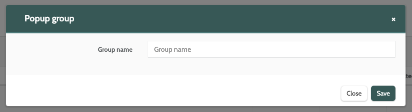
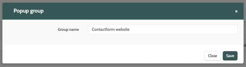
To create a new popup, you must first create a group.
Click + New group to get started.
If you have already created a group and want to create a popup, skip to Add Popup.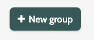
Enter the name, and click Save.
When you have created a popup group, there are several options to work with.
Select either Edit, Add popup, or Option.
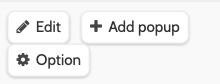
Edit
When you have created a popup group, click Edit to rename it.
Add popup
Click Add popup to begin creating your popup.
The form is divided into three section: Popup details and style, Form options, and Display options.
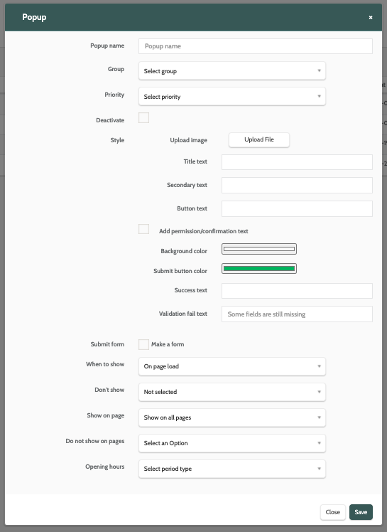
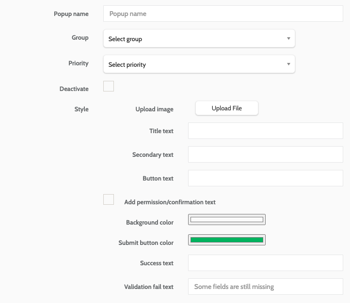
Popup details and style
In the first section, enter the following information:
- Popup name: the name for your popup. This is internal only
- Group: expand the menu and select which group the popup should belong to
- Priority: expand the menu and enter a priority. If there are several popups in your group, the priority will determine in what order they will be displayed
- Deactivate: if you are editing an existing popup that is live on your website, check this box to deactivate it
- Upload image: click Upload File to upload an image from your desktop for the popup. A preview will be displayed
- Title text: the title text for your popup
- Secondary text: the secondary text that will be displayed under the title
- Button text: the text to be displayed on the popup button
- Add Permission/Confirmation text: check the box to add a permission or confirmation text, such as a Terms and Conditions disclaimer. Enter the text to be displayed in the text field
- Background colour: use the colour picker to choose a background colour for your Popup. We accept RGB, HSL, and HEX format
- Submit button colour: use the colour picker to choose a colour for your button
- Success text: the text to be displayed when the user has successfully submitted the form
- Validation fail text: the text to be displayed if the user tries to submit the form without filling in all of the fields.
Form options
Enter the following information for form options:
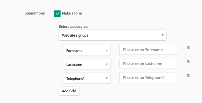
- Submit form: check this box if you want to make the popup a form for users to submit
- Select leadsource: expand the menu and select a leadsource. When users sign up they will be belong to this leadsource
- Add Field: click this button to add a field for your popup. Repeat as needed.
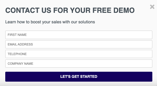
When you have added a field, a menu will be displayed. Select a data type. In the text field next to it, enter the text that will appear in the field on the popup.
In the image below, the popup will have 4 lead fields. The user will enter their first name in the text field that says Please enter Forename, and that data will be saved as a Forename data field in Flows.
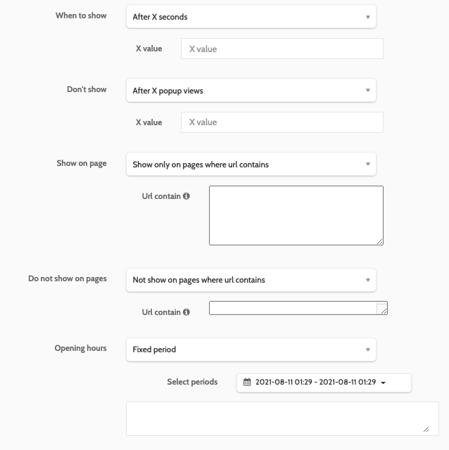
Display options
Enter the following information for display options:
- When to show: choose when you want the popup to be displayed. Choose between On page load, After X seconds, When X pixels from the top, When X pixels from the bottom, and On click. If applicable, enter the dependent value in the text field
- Don't show: to prevent the popup from being shown in certain situations, to certain users, choose an option from the menu and enter the value
- Show on page: choose on which pages the Popup will be displayed. Choose between Show on all pages, and Show only on pages where URL contains. If you choose to only show it on certain pages, enter the URL value in the text field.
- Do not show on page: choose the pages the popup should not be displayed on. Choose between Not show on all pages, and Not show on pages where URL contains. If you choose to limit the popup showing on certain pages, enter the URL value in the text field
- Opening hours: decide what days and times your popup will be active for. Choose between a Select period type, Fixed period, or Recurring period.
When you have finished creating your popup, click Save.
Working with popups
Once you have created the popup, there are several options to work with:
Click the Option button to the right of the popup in the navigation page, and choose between Delete, Preview, and Get Script.
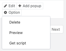
Delete
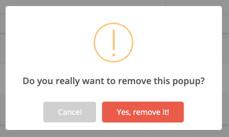
If you want to delete a popup, you will be asked to confirm, as deleted popups cannot be recovered.
If you are sure, click Yes, remove it!
Preview
Preview how your popup will look. If you need to change any aspect of your popup, simply click Edit.
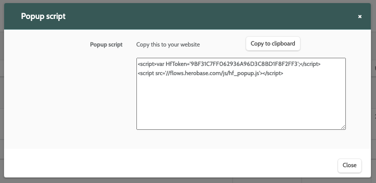
Get script
When you are happy with you popup and are ready to implement it on your website, click Get Script.
Copt the script either directly or by clicking Copy to clipboard, then paste it in the HTML of your website's code.