
Insights: Scoreboards
Scoreboards allows you to construct visual reports for assessing the performance and achievements of campaigns, segments, and teams.
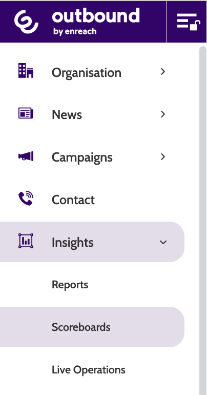
Navigation
Scoreboards can be found under the Insights menu.
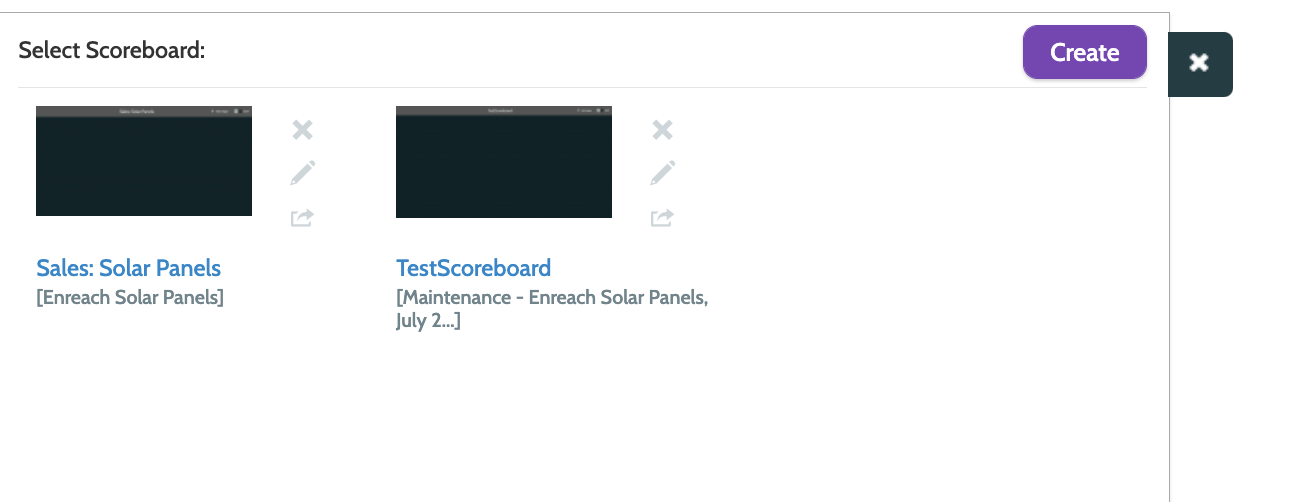
Existing scoreboards will be displayed here.
Click a Scoreboard to view or edit it.
To the right are some options: click the cross to delete a scoreboard, the pencil to edit, and the arrow to share the scoreboard with others in your organisation.
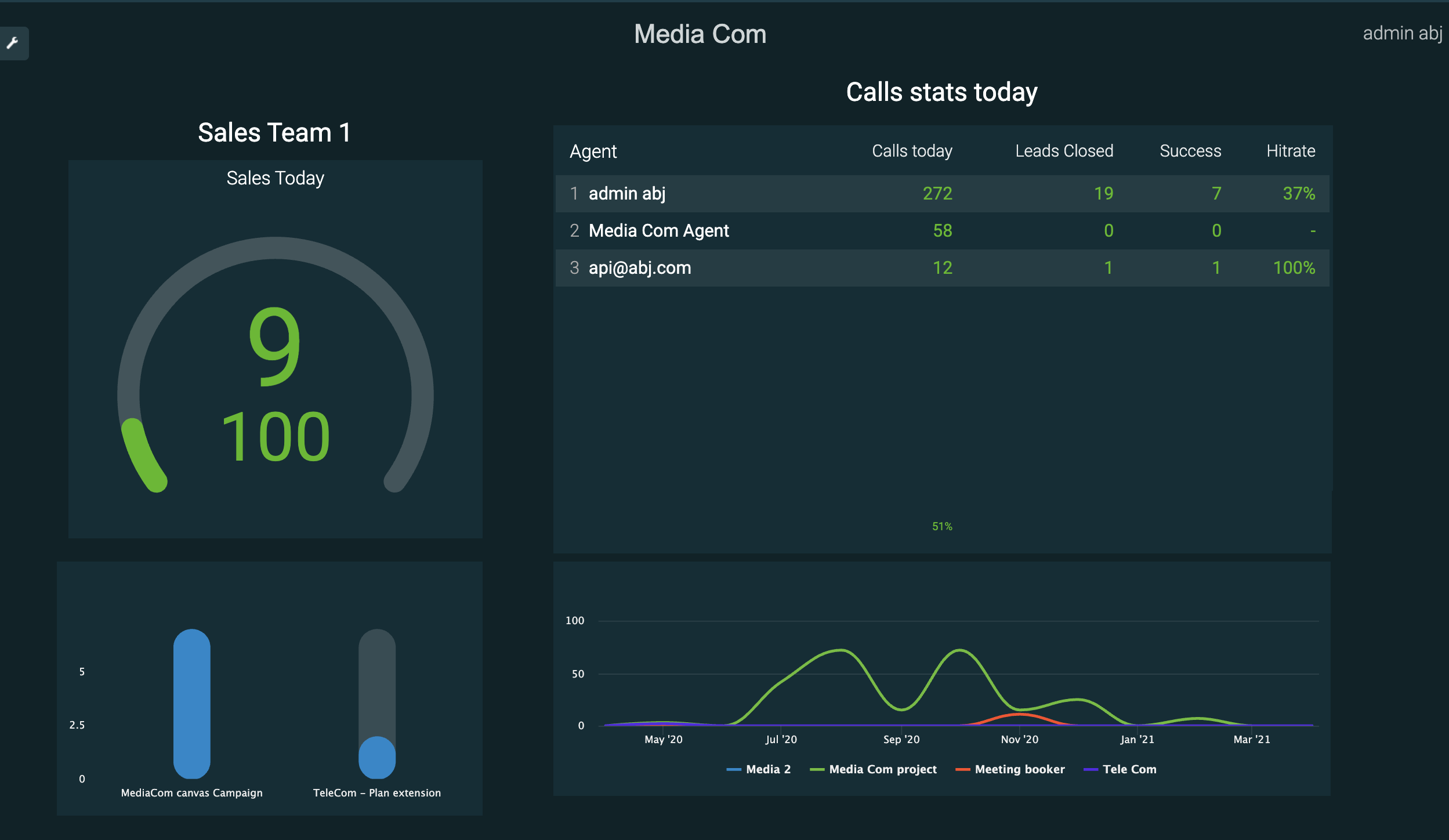
To return to the scoreboard list when in viewing mode, click the spanner tab.

Existing scoreboards are totally customisable, but will look similar to the one below. In the image below you can quickly gain an overview of the performance of Sales Team 1, including their daily call stats by agent, and how close they are to reaching their target.
Create a scoreboard
To create a new scoreboard, click Create.
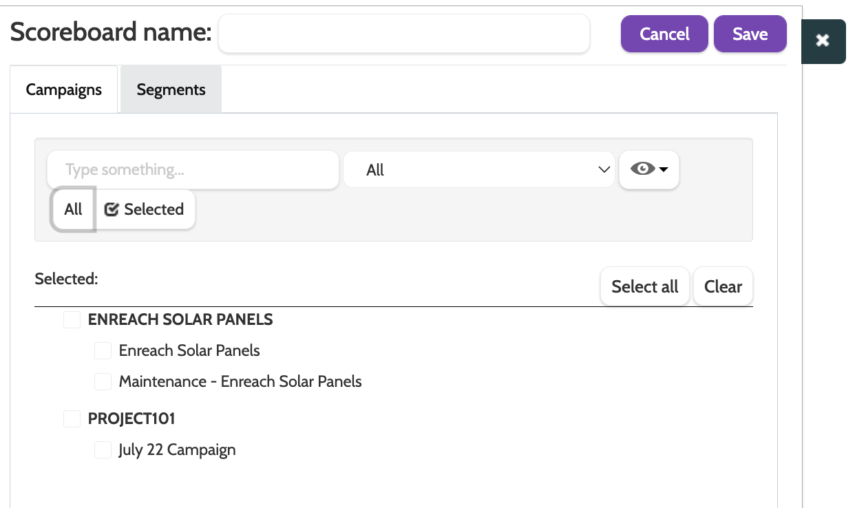
- First, enter a name for your Scoreboard
- Toggle between campaigns and segments to decide what data you want to work with
- Click All to choose which available campaigns or segments should be included
- The eye icon allows you to filter between active or inactive campaigns or segments.
When you have saved your preferences, you will see a blank page.
The first thing to do is add a widget. Toggle the Edit switch to green, and click Add widget.
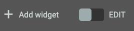
There are 8 different widgets to choose from.
Click a widget to add it to the Scoreboard, and click and drag to the desired size. Don't worry, the size and position of the widget can be changed later.
Choose from Number, Speedometer, Table, Graph, Column Chart, Pie Chart, Text, and Image.
Number
The number widget will compare the performance of two selected KPIs over a set period of time. This is really useful for tracking the number of successful calls and the sum total profit, for example.
In the wizard, enter the following information:
- Add a title: a descriptive name that explains what data is displayed
- Metric: choose which KPI will act as the first metric, displayed as the top data field
- Second Metric: choose which KPI will act as the second metric, displayed underneath the primary metric
- Time Period: choose a time period to filter the KPI data by
- Teams: select which teams you want to filter the data by
- Accuracy, decimals: if you are using a KPI that displays a percentage, you can configure how many decimal points will show
- Exclude Empty Records: check this box to exclude fields with no data
- Trigger Function: adding a trigger function will turn the KPI data field red, depending on whether it is more or less than the value entered in the trigger threshold below. Choose between If [value] > Threshold then RED and If [value] < Threshold then RED
- Trigger Threshold: enter the threshold that will determine the KPI data field turning red, if you have chosen to add a trigger function. For example, if you choose Call Attempts as the first metric, set the trigger function to If [value] < Threshold then RED, then set the trigger threshold to 500. If the Call Attempts are lower than 500, the metric will be displayed in red.
Click Save to finish setting up.
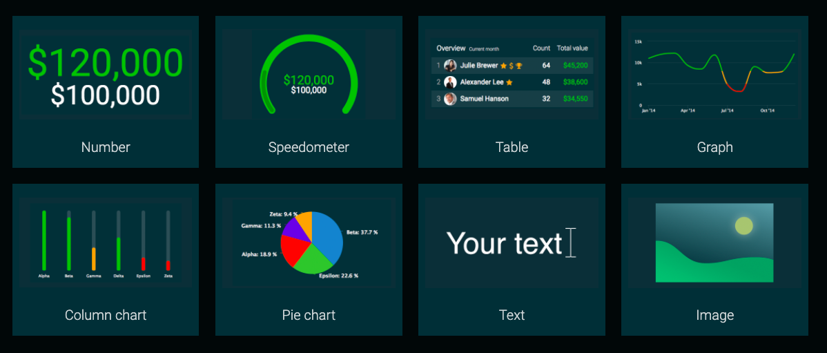
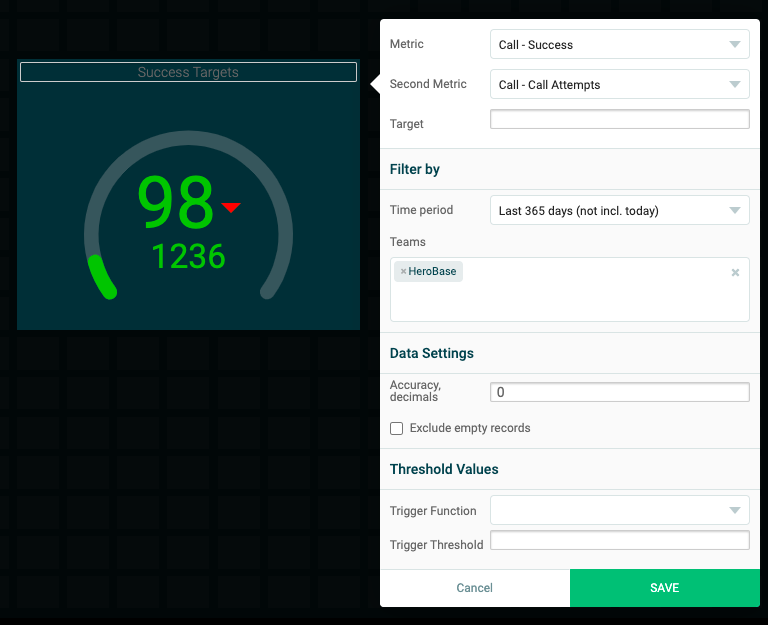
Speedometer
The speedometer widget will compare the performance of a KPI against a static target KPI, and is a useful visualisation of how close is the KPI to reaching the target goal.
In the wizard, enter the following information:
- Add a title: a descriptive name that explains what data is displayed
- Metric: choose which KPI will act as the first metric, displayed as the top data field
- Second Metric: choose which KPI will act as the second metric, displayed underneath the primary metric
- Time Period: choose a time period to filter the KPI data by
- Teams: select which teams you want to filter the data by
- Accuracy, decimals: if you are using a KPI that displays a percentage, you can configure how many decimal points will show
- Exclude Empty Records: check this box to exclude fields with no data
- Trigger Function: adding a trigger function will turn the KPI data field red, depending on whether it is more or less than the value entered in the trigger threshold below. Choose between If [value] > Threshold then RED and If [value] < Threshold then RED
- Trigger Threshold: enter the threshold that will determine the KPI data field turning red, if you have chosen to add a trigger function. For example, if you choose Call Attempts as the first metric, set the trigger function to If [value] < Threshold then RED, then set the trigger threshold to 500. If the Call Attempts are lower than 500, the metric will be displayed in red.
Click Save to finish setting up.
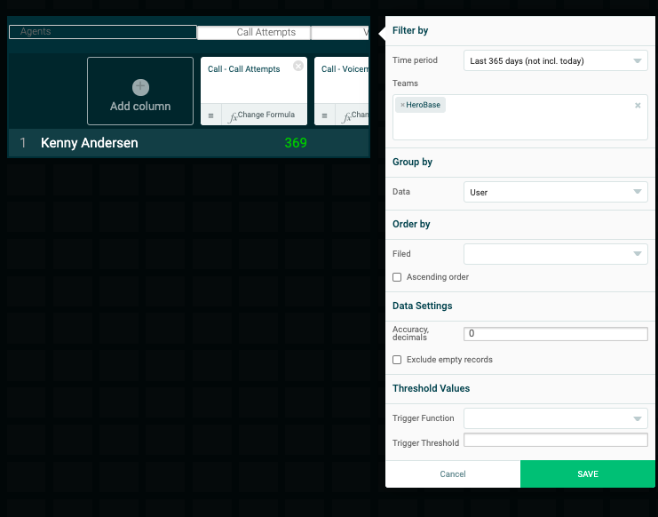
Table
The table widget will compare a number of KPIs against agents, so you can gain a quick overview of their performance in certain areas.
In the wizard, enter the following information:
- Add a title: a descriptive name that explains what data is displayed
- Add column: click the plus sign to add another column to the Table. Repeat as necessary
- Time Period: choose a time period to filter the KPI data by
- Teams: select which teams you want to filter the data by
- Data: choose to group the teams according to Campaign, Segment, Project, User, and Team
- Filed: choose which KPI should be displayed in the table column
- Ascending Order: check this box to display the KPI data in ascending order
- Accuracy, decimals: if you are using a KPI that displays a percentage, you can configure how many decimal points will show
- Exclude Empty Records: check this box to exclude fields with no data
- Trigger Function: adding a trigger function will turn the KPI data field red, depending on whether it is more or less than the value entered in the trigger threshold below. Choose between If [value] > Threshold then RED and If [value] < Threshold then RED
- Trigger Threshold: enter the threshold that will determine the KPI data field turning red, if you have chosen to add a trigger function. For example, if you choose Call Attempts as the first metric, set the trigger function to If [value] < Threshold then RED, then set the trigger threshold to 500. If the Call Attempts are lower than 500, the metric will be displayed in red.
Click Save to finish setting up.
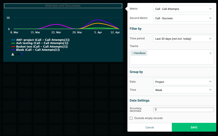
Graph
The graph widget will compare the performance of two selected KPIs over a set period of time in a line graph. This is really useful for tracking the number of successful calls against teams or users, for example.
In the wizard, enter the following information:
- Add a title: a descriptive name that explains what data is displayed
- Metric: choose which KPI will act as the first metric, displayed as the top data field
- Second Metric: choose which KPI will act as the second metric, displayed underneath the primary metric
- Time Period: choose a time period to filter the KPI data by
- Teams: select which teams you want to filter the data by
- Data: choose to group the teams according to Campaign, Segment, Project, User, and Team
- Time: filter the KPI data by Day, Week, or Month
- Accuracy, decimals: if you are using a KPI that displays a percentage, you can configure how many decimal points will show
- Exclude Empty Records: check this box to exclude fields with no data
Click Save to finish setting up.
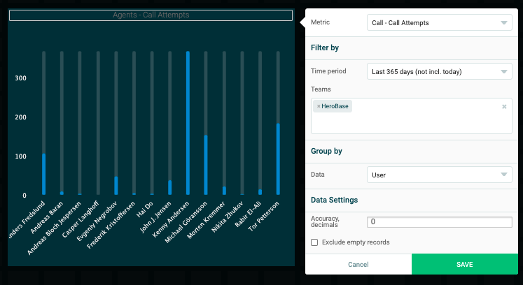
Column chart
The column widget will show the performance of a Campaign, Segment, Project, User, or Team, against a selected KPI in the form of vertical columns.
In the wizard, enter the following information:
- Add a title: a descriptive name that explains what data is displayed
- Metric: choose which KPI will act as the first metric, displayed as the top data field
- Time Period: choose a time period to filter the KPI data by
- Teams: select which teams you want to filter the data by
- Data: choose to group the teams according to Campaign, Segment, Project, User, and Team
- Accuracy, decimals: if you are using a KPI that displays a percentage, you can configure how many decimal points will show
- Exclude Empty Records: check this box to exclude fields with no data
Click Save to finish setting up.
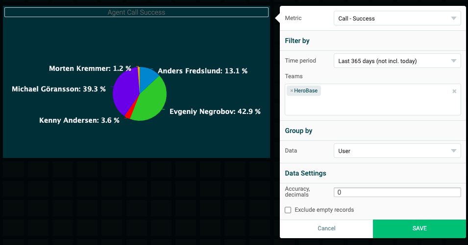
Pie chart
The pie chart widget will display KPI data in a pie chart, according to which Campaign, Segment, Project, User, or Team you have selected.
In the wizard, enter the following information:
- Add a title: a descriptive name that explains what data is displayed
- Metric: choose which KPI will act as the first metric, displayed as the top data field
- Time Period: choose a time period to filter the KPI data by
- Teams: select which teams you want to filter the data by
- Data: choose to group the teams according to Campaign, Segment, Project, User, and Team
- Accuracy, decimals: if you are using a KPI that displays a percentage, you can configure how many decimal points will show
- Exclude Empty Records: check this box to exclude fields with no data
Click Save to finish setting up.
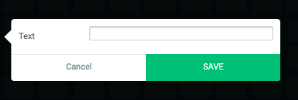
Your text
The text widget will allow you to display a simple text box in your scoreboard.
Enter your text and click Save to finish setting up.
Image
The image widget will allow you to display an image from your computer in your scoreboard.
Click File to select an image from your computer's file, and click Save to finish setting up.